Romance Book Cover
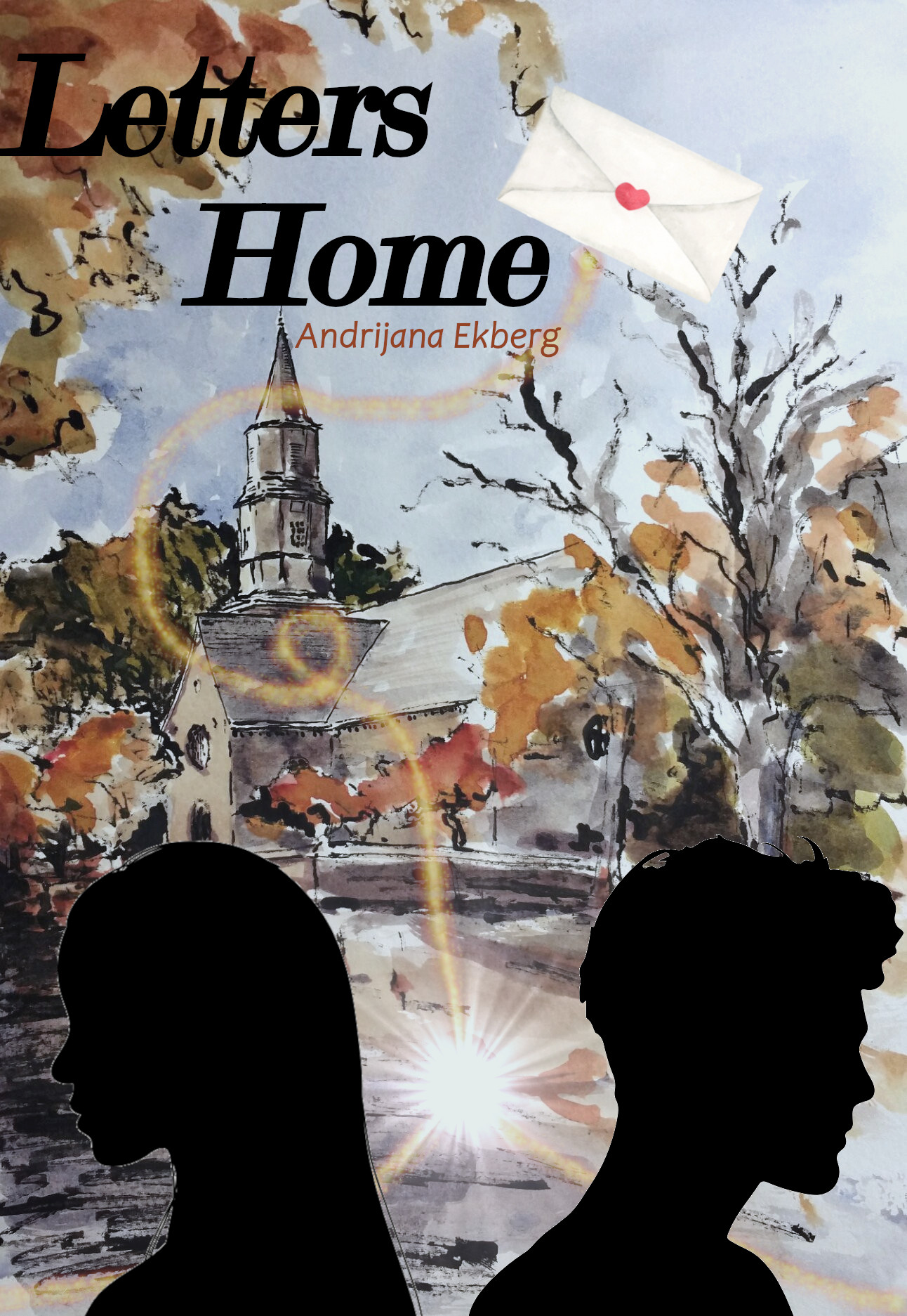
For this part of the project, I chose to create a romance book cover with a watercolor background, incorporating various bitmap images and tools. I used Gimp to accomplish my vision. I began by uploading the background and minimizing the opacity. After adding the two silhouette layers, I inverted them to remove the white background and resized both silhouettes to ensure they were equal in size. I then added a watercolor envelope as a new layer and used the scissor tool to eliminate the white background, cleaning up the edges with the eraser tool. To create a sense of flow, I used the Sparks brush in a hue that matched the fall trees in the background and the tool to connect the silhouettes and envelope. I then added a supernova filter between the two silhouettes. The design choice is intended to symbolize an invisible string connecting the characters, reflecting their ties to each other in their hometown and through the exchange of letters. I added the title text and set it in a bold, italicized font. Then, I added a new textbox below for my name as the author, selecting a simple text and color that fit the background. Lastly, I adjusted the background saturation and color temperature, as the original image was very bright and saturated. Creating a book cover for this project was an exciting design experience, allowing me to let my creativity run free with what I envisioned. Overall, I am pleased with the design and look forward to embracing further artistic projects such as this book cover.
Podcast Logo
Using Photoshop, I created a logo for a podcast that features imagery evoking the feeling of sitting around a campfire with friends, telling stories. I wanted to design a simple logo of a fire pit. I started by simply creating a circle, setting a gradient as the fill color, and then reforming the points until it resembled a teardrop. I converted the graphic to a smart shape and used the blending options to add dimension effects, such as a drop shadow, satin structure, an inner glow, and a smooth outer bevel with yellow coloring to make the outer edges glow. Using the brush tool, I added an additional light glow around the fire, then used the liquify tool to enhance the shape of the fire and flames. Moving on to the logs, I began by creating rectangles, coloring them brown, and rotating them to fit underneath the fire image. These were also converted to smart objects, and I utilized blending options again, including drop shadows and satin linear burn. From there, I used the liquify tool to modify the shape of the logs, so they were not straight lines. To add more dimension, I used a brush tool in a light color to draw lines on the logs, aiming to create a woodgrain effect. Lastly, I added the text and used the blending options to enhance the look, including an outer glow, a drop shadow, and an outer bevel stroke. Then, I used the warp text in a rise style to give it some movement. Working on creating this logo from scratch in Photoshop took many more steps than I initially anticipated. However, it shows the skill and effort that go into creating graphics that individuals search for, pay for, and use regularly.